
Timeline
Dec 2023 - Present
Role
Lead Product Designer
Team
Matt Williams, Product Manager & CEO
Arai Yegros, Data Analyst
Tayyab & Floyd Johnson, Software Developer
Keith Scott, Board Advisor
Dave Hem & Jon, Brand Ambassadors
Tools
Figma
Google Workspace
MondayCRM
Slack + Discord
Responsibilities
UX/UI Mobile Design, Design System, Prototyping, Testing
Product Strategy, Branding, Flyers Design
Pitch Deck Design, Design Handoff Documentation
Human-Centered Design, Research-led, Iterative Prototyping
Why an app?
Philadelphia’s incarceration rate is rising, but support remains scattered
Jail populations are climbing again. There are hundreds of nonprofits working on reentry, yet many people don’t know where to go for help. Even with access to phones, that support often remains out of reach. With growing urgency, we knew we had to build an app that delivers clarity, access, and support, right at their fingertips.


Background
Within just three years of release, nearly 2 out of 3 people are rearrested
This cycle of recidivism highlights the urgent need for better reentry support. Through the PHU app, we saw an opportunity to uplift individuals by making essential services easier to discover and access, so they can take the first step toward rebuilding their lives.

Problem
Reentry is overwhelming, disconnected, and hard to navigate
Many individuals return from jail unsure of where to go, what to do, or how to start over. They often lack the tools, skills, and awareness to move forward. At the same time, nonprofits struggle to connect with the people they are trying to help.
Solution
An app uniting support systems for people starting over.
Through multiple iterations informed by research, feedback, and business needs over the past year, I designed an MVP prototype that offers solutions supporting people from daily survival to long term growth.
Design Process
MVP UX Design Process
Leading design meant making intentional decisions grounded in research and real user needs. By prioritizing core pain points and iterating based on feedback, I shaped an MVP experience that was clear, usable, and goal aligned.

Research
Understanding the Problem
We interviewed 20+ nonprofit organizations across Philadelphia to understand the challenges people face after release. They worked directly with impacted individuals and shared valuable insights into their daily struggles. We shared early mockups to gather feedback, which shaped both our design and our understanding of user needs.


The on-site team conducted field studies and attended local programs to better understand the environment, needs and behaviors of the users. These visits helped validate our direction and added depth to the remote research.


Research
Gathering Insights from the Ground
To understand user needs and challenges, our team collaborated with nonprofit organizations who spoke directly with individuals impacted by incarceration. They asked focused questions about reentry, technology access, and support needs. The responses were grouped into six key areas, helping us shape design decisions through affinity mapping.

Key Takeaways
The affinity map helped us organize and synthesize findings from both users and nonprofit staff. By clustering responses into themes, we uncovered key behaviors, frustrations, and motivations that shaped our design priorities and helped us focus on the most urgent needs.

Research
Competitive Analysis
Through my analysis of FYWinPA and Findhelp, I found that while they list resources, they lack features tailored to reentry needs such as job support, events, and a modern UX. This helped me identify clear gaps and design the PHU App as a focused, all-in-one tool to support both survival and long-term growth after incarceration.

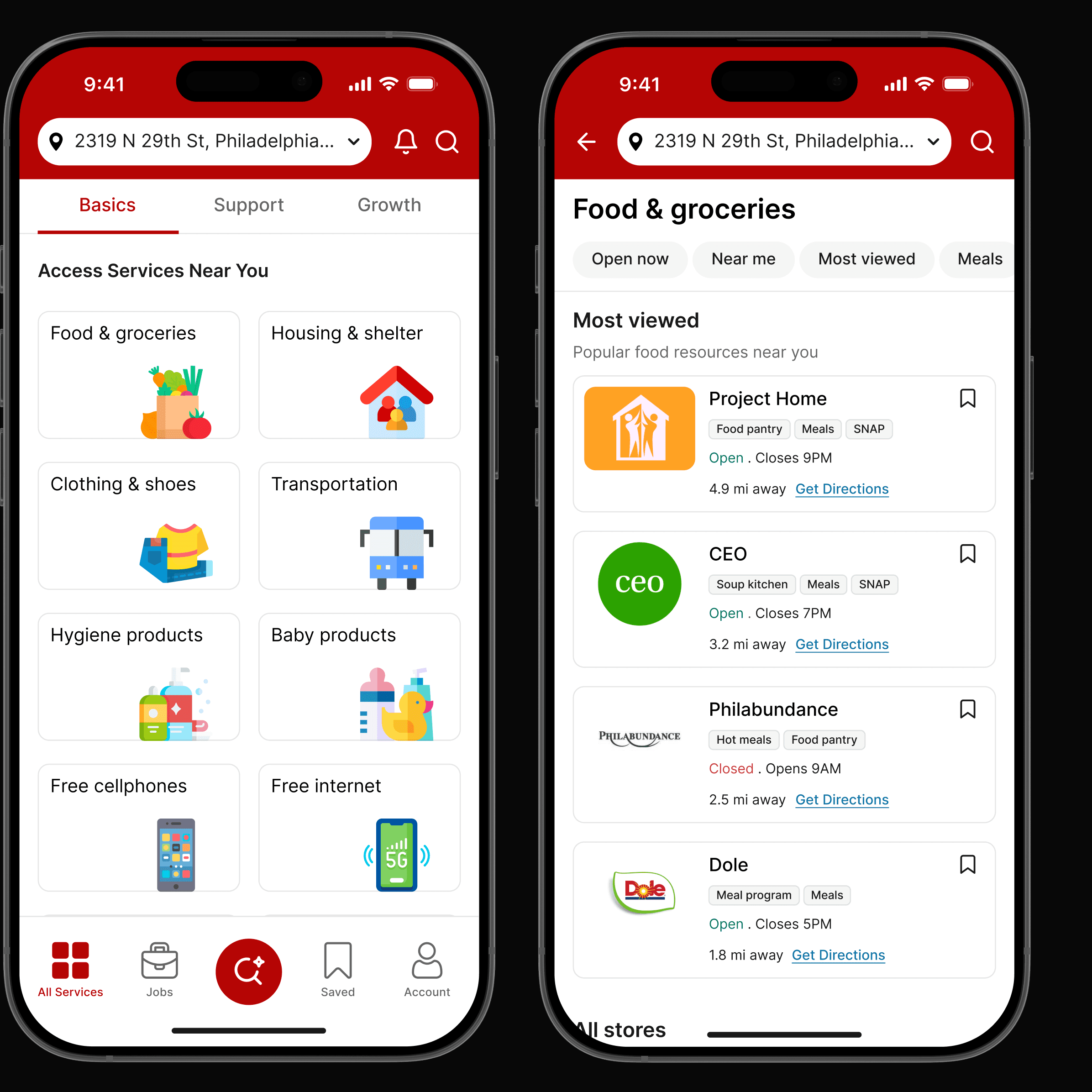
Design Decision
Scalable UI Patterns for Better Usability
A/B testing revealed that the stacked list made it hard to locate categories quickly. Switching to a grid layout with modular cards made options easier to spot at a glance, gave equal emphasis to all services, and introduced a reusable system for clearer, consistent navigation across the app.

Design Decision
A Cleaner Layout for Decision-Making
After thorough testing and iteration, we decided to move from a dense layout to a more structured and readable format. The updated screen highlights key information, reduces visual clutter, and applies hierarchy to help users scan job details quickly and take action with confidence.

Design Decision
Job Details Card Anatomy
Since job seekers rely on quick scans to evaluate listings, I collaborated with Arai and our non-profit partner to identify the most relevant job details and iterated on a card layout that brings those elements to the forefront.

Ideation
Card Sorting Activity
To translate user research into meaningful features, we used card sorting to group and prioritize features across core categories, helping us focus on what drives user adoption and long-term engagement.

Ideation
Logo Design
The brand evolved from Unlimited Errands to Philly Unlimited to reflect local identity and purpose. “Philly” highlights community and love, highlighted using the brand color. The wing, inspired by the Philadelphia Eagles, symbolizes freedom and second chances. The tagline reinforces this by representing endless possibilities.

Ideation
Design Systems
To ensure consistency and scalability across the product, I created a design system covering core elements like color, typography, spacing, and components. This system allowed for faster design decisions and smoother handoff to developers.

Post Design Outcomes
Market Validation
☑️ Secured grants and donations totaling up to $20K+
☑️ Signed 10+ partners within 3 months
☑️ More organizations want to offer their services through the app.
Product Development
☑️ MVP design scheduled for completion by end of July 2025
☑️ Pilot testing planned for August 2025
☑️ Public launch on Apple and Google Play Store in September 2025
Post Design Outcomes
My Learnings
Collaborating early and often with developers helped align design and technical constraints
Take inspiration from all fields and identify UI patterns
Embrace ambiguity. Ask questions to deeply understand people and the problem space
Building trust and strong relationships through communication is key when working with nonprofits
Have a logical reasoning for each design
Designs are engineered around feelings. Ask: What's the one core emotion we want the user to feel when using the product?
Next Steps
Conduct user testing before launch and iterate based on feedback
Measure user adoption and engagement using defined success metrics during pilot and launch.
Run a second round of interviews and surveys to validate new ideas